Summertime Apartment Refresh!
*This post may contain affiliate links. If you click on the link and purchase the item, I will receive commission on the sale at no extra cost to you. It’s a win for both of us! Keep in mind that I only ever recommend products that I use and love myself and all opinions are 100% my own. Thanks for your support!*
Can y’all believe it’s been almost a year since Ira and I moved into our second apartment together?! I’ve gotten pretty used to moving furniture—this is my NINETH apartment since moving out of my mom’s house for college in 2014. Yeah. Nine apartments in 6 years. Fuuuun stuff. Luckily though, my tenth move will be my last move for a long, long time. If you’re new here, you may not know that we’re currently building a house & it’s scheduled to be done in September!! Of course we’ll be packing all of this stuff up soon (hopefully for the last time) I figured, why not spend a day rearranging everything first?!
Hahah I’m joking…kinda. Ira tried to talk me out of rearranging the furniture, saying it would be a total waste of time and blah blah boy stuff that really didn’t do anything to convince me to change my mind about the current aesthetic of the space. So I did what I normally do and rearranged everything anyway. But before I show you my new living room, let’s take a look at the previous renditions. You can go back and check out what the apartment looked like when we first moved and I’ll just jump right into Augustish time frame.
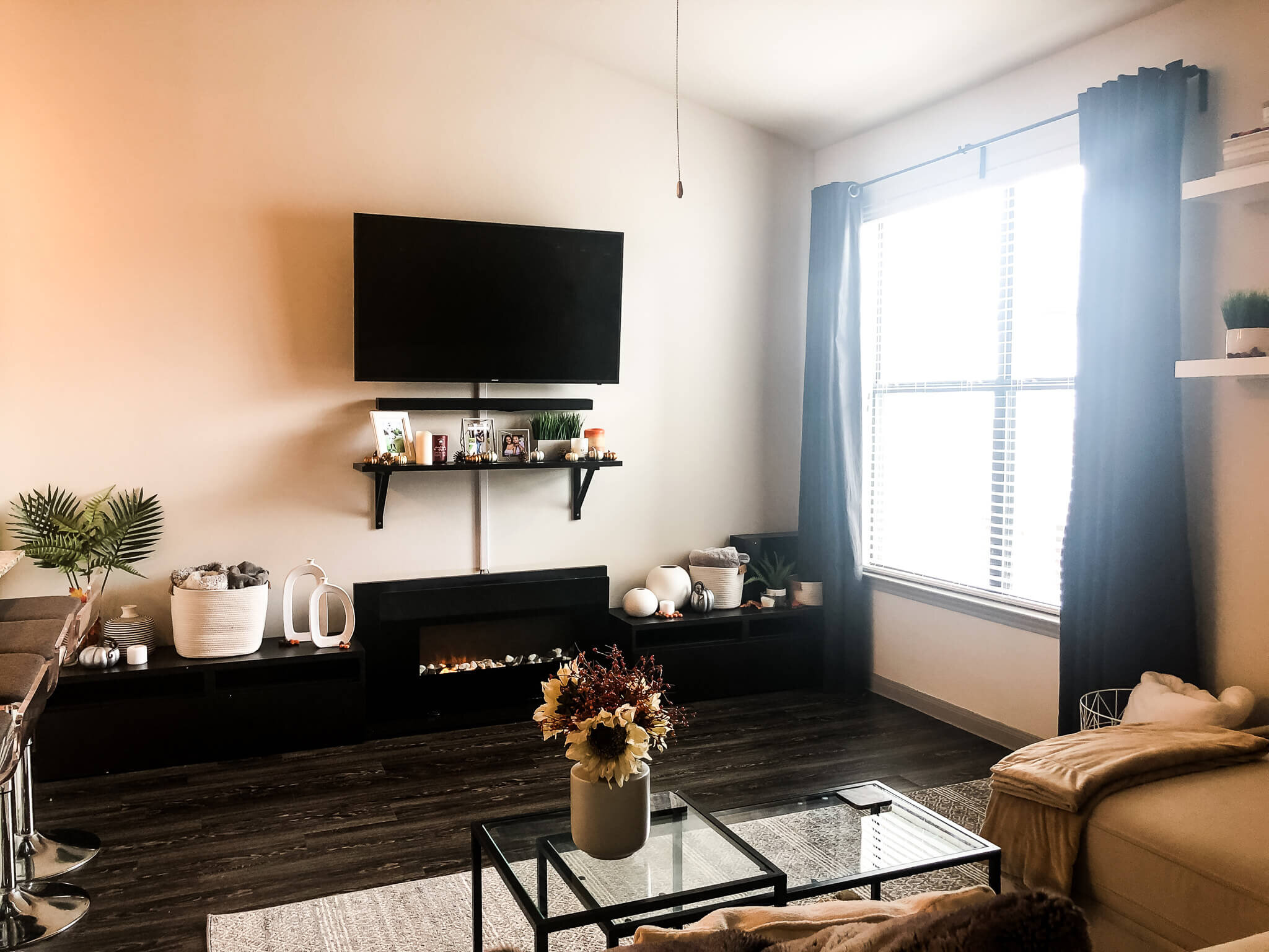
This was my first attempt at styling the main wall of our living room around the media cabinets, fireplace, and TV just after we moved in. I sat with a while, but ultimately didn’t like the look of alllll that decor across the entire surface of the media cabinets. It felt more like a store display and not so much like a living room. Plus, having all of that stuff so low to the ground made the TV feel like it was mounted way high up.
I toned down the decor a bit when I decorated for fall, but the whole thing still wasn’t really working for me. The media cabinets are just so low compared to the TV and the super high ceilings, making the entire wall look off balance. I really wanted the cabinets to work this space though because the width was perfect and they framed the fireplace nicely, but alas, not everything turns out like we imagine it in our heads.
Looking at it again now, I don’t think it looks terrible, but I always felt like it could look better. My original plan was to mount the fireplace on the wall and get taller media cabinets, but the placement of the wall studs ruined that dream. So it stayed like this for a few months until Christmas time…
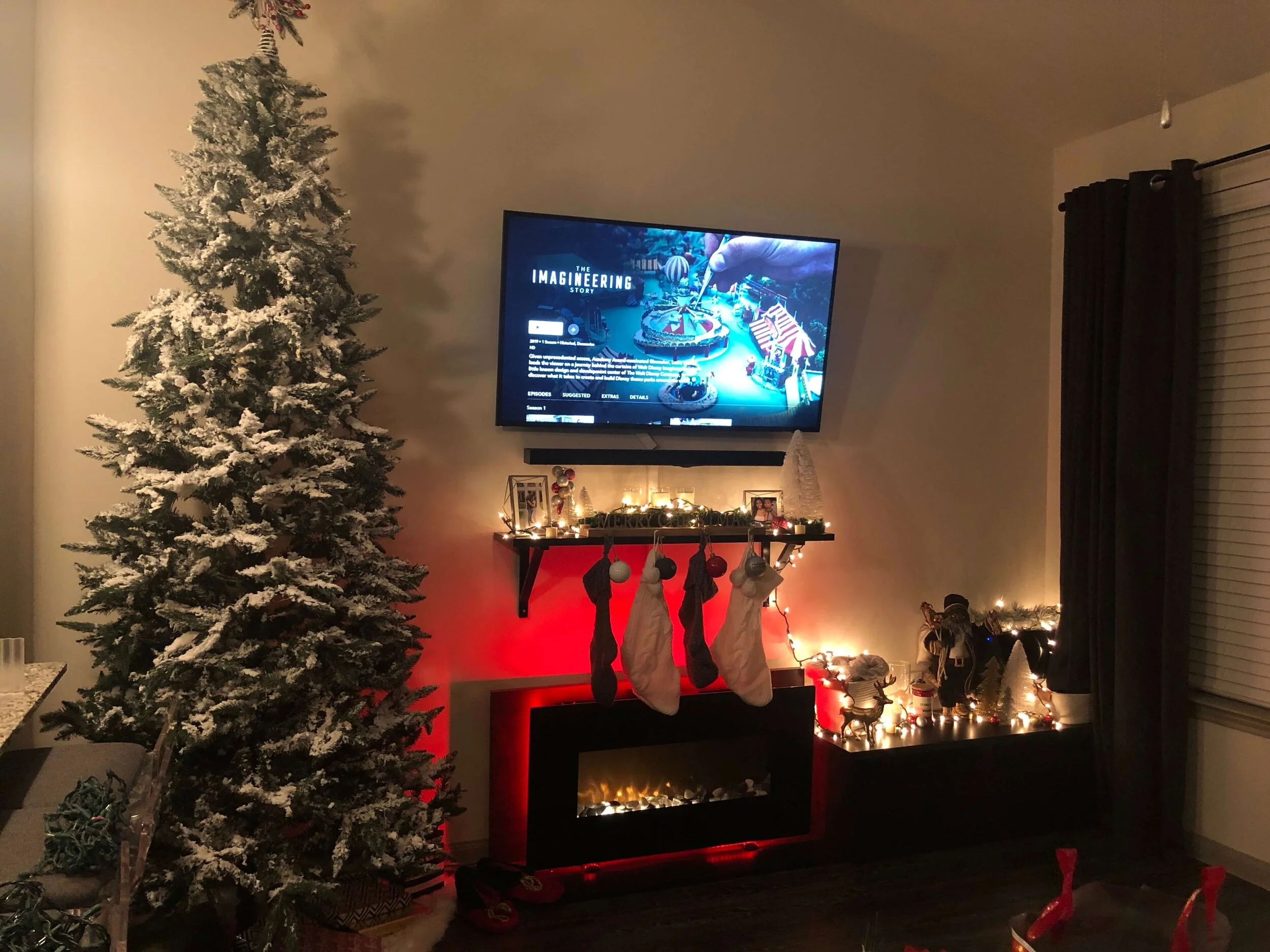
and THAT was when I knew for sure I needed something taller on this wall to take up some of the vertical space. Our Christmas tree looked perfect next to the TV and I was super tempted to leave it up year round, but Ira would’ve never let that happen. Also, it was right around this time that we brought Ginger home so after the Christmas decorations were down, the whole wall basically sat empty for months. Because the dang media cabinets are so low (can you tell how much I’m over them? haha) I didn’t want little puppy paws tempted to knock over anything that looked like it might be fun to play with by having it so close to the floor. But now…
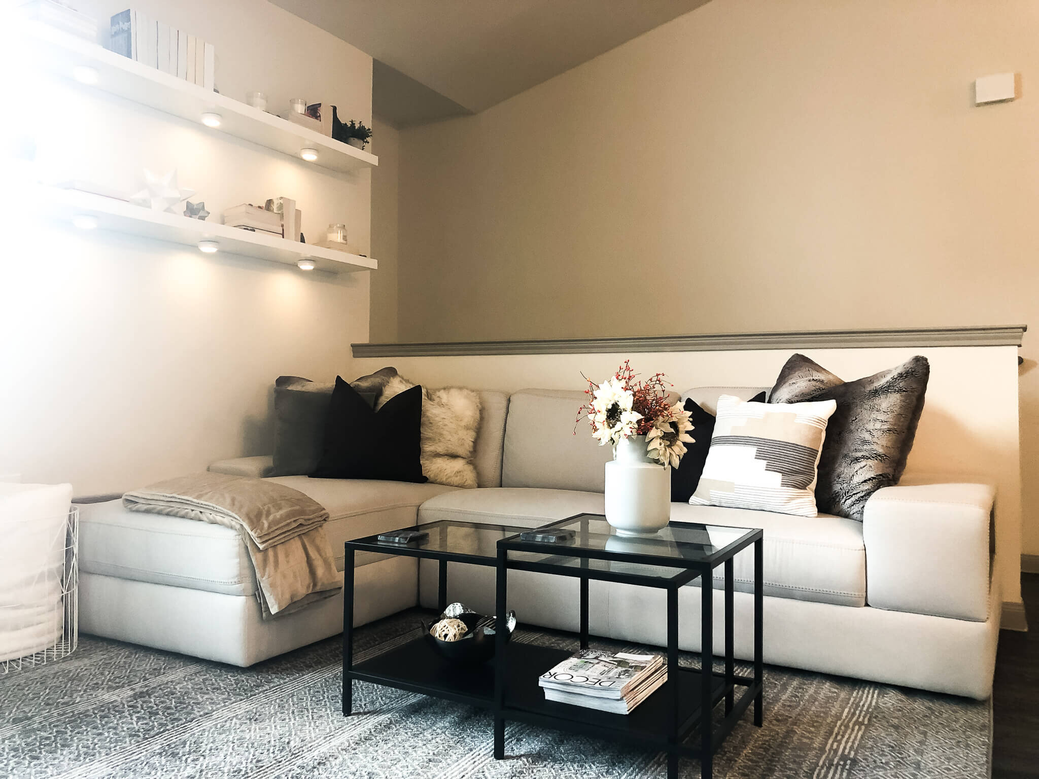
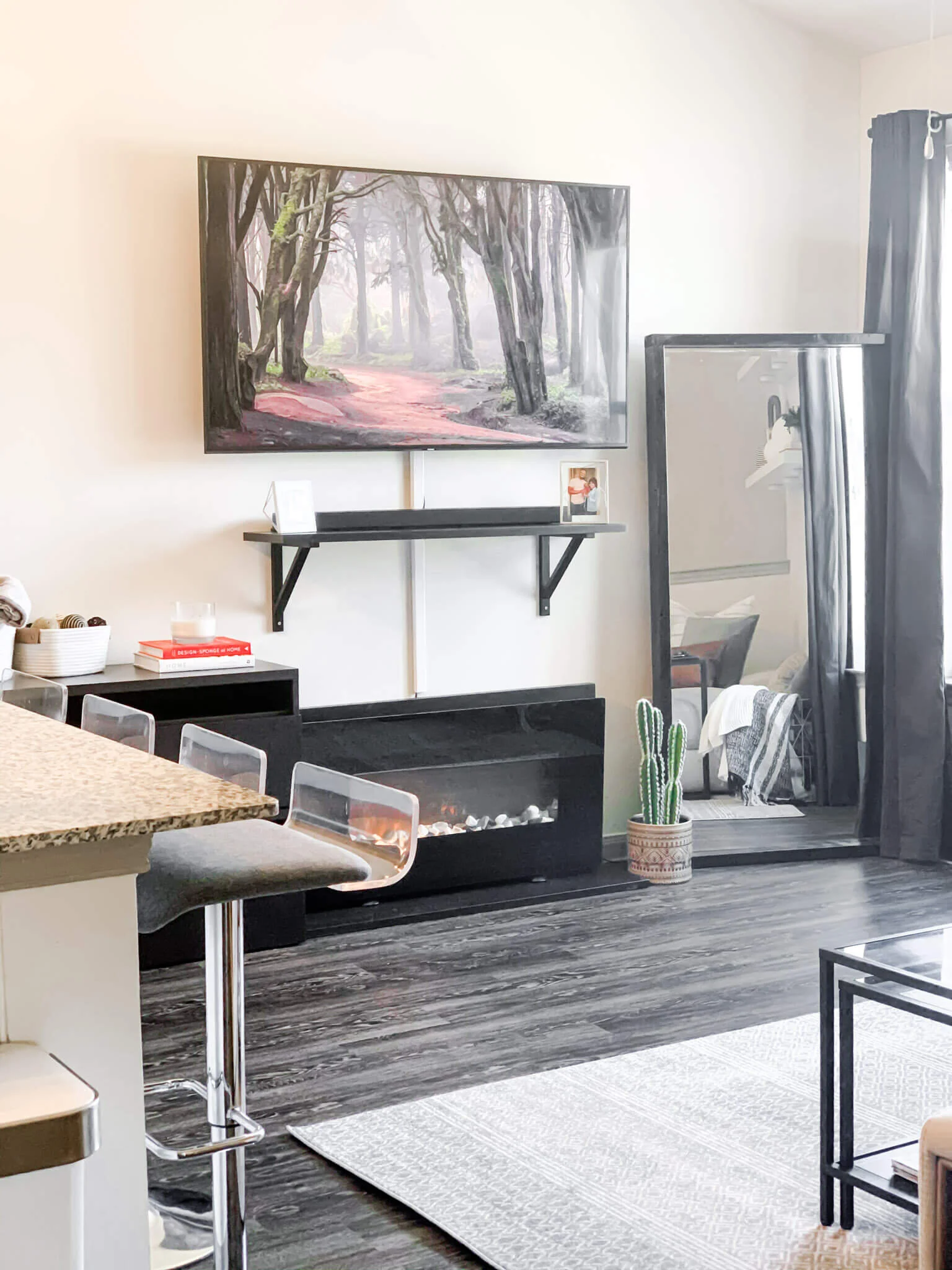
It’s perfect! And by perfect I mean much, much better + I didn’t have to spend a single dolla so I’m going to be happy with what I’ve got and patiently wait until I can really decorate our living room in the new house 🙃The mirror is the same one I reframed last year—I just hauled the heavy beast of a thing to lean next to the window. It’s much better for taking pictures in now that it’s next to the (only) window and the new location makes the room feel so much bigger. The too-low media cabinets are now the perfect height after stacking one on top of the other. No more having to worry about Ginger accidentally knocking a vase over while doing zoomies around the apartment. I love this clean, simplified look 297438307x better and I even won Ira over! His actual words when he saw it were “WOW. I love it. You should’ve set it up like this months ago.” So much for wasting my time, huh? Keep scrolling through for more pictures of the whole space + shop my decor favorites (or similar items) below :)


