Our (Quarantine) Design Studio Experience + The Upgrades We Chose For Our Home!
*This post may contain affiliate links. If you click on the link and purchase the item, I will receive commission on the sale at no extra cost to you. It’s a win for both of us! Keep in mind that I only ever recommend products that I use and love myself and all opinions are 100% my own. Thanks for your support!*
Building a house in the middle of a pandemic is…different. Ira and I started our home building search/process before things really started to get crazy—back when TP was a low-value commodity and people could still hang out in public. By the time we actually signed our contract, the model homes were open by appointment only, in-person meetings were few and far between, and construction was deemed “non-essential business” and put on hold. SO much changed in the world in just a few short weeks, so naturally, our design studio experience would have to adapt as well. I have to admit, I was a bit bummed when I first heard we would have to pick some of our design options virtually (I’ve been waiting my whole life to build this house! Sue me.) But, that disappointment was quickly shoved to the side when I reminded myself that we were blessed to still be able to build a house at all. So I sucked it up, we waited for good news, and it came!
We did have to pick all of our electrical/low voltage options via Zoom call, but that wasn’t a big deal at all. There’s nothing particularly sexy about electrical wiring, so I didn’t mind sitting that meeting out in the comfort of my own home. I’ll be doing a big ‘ole post later that has all of the upgrade deets (and yes, pricing!), but for now, I’ll just go over our main choices & what we decided to save for later. We kept it pretty simple with our electrical upgrades (at least by my standards) and only added things we felt we would actually use. I definitely recommend going ahead and adding pre-wiring for lights or sconces, additional outlets, surround sound pre-wire—all of those would be pretty tricky to add later since electrical work requires 1) cutting into the drywall and 2) hiring an electrician to come out and do the work. Electricity is not something to mess with if you don’t know what you’re doing, so it’s definitely not the best idea to DIY it.

On the outside of the house, we added two coach lights to our garage door area (to make 3 total) and up lights under the large window in the front. Exterior lighting is a major game changer and can really elevate the look of your house at night, so go for the additional lighting! We got all of our exterior lights wired to the same switch inside the front door so that we can control them all at once. We’ll swap this out for a timer switch later so that the lights come on automatically at dusk and turn off before bedtime. We also added a few outlets in the upper soffits on the roofline for plugging in our security cameras and holiday lights.
On the back covered patio, we added blocking for a ceiling fan and pre-wiring for two speakers to make the space perfect for relaxing and entertaining. We haven’t decided yet on just what we want to do with the backyard space, but I really want there to be multiple areas for hanging out, eating, and hosting company, while still leaving enough grassy area for Ginger to play. I’m envisioning some kind of landscaping around the perimeter of the yard, but gardening is not at all my forte so it’ll have to be something minimal and self-maintaining.

Source: Falling Water Landscape
In my wildest design dreams, I’d have the least amount of grass possible, turf even! I’d fill the space with pavers, decking, and a water feature—because no outdoor space is complete without a water or fire feature! Ira, on the other hand, LOVES cutting grass. He lives for it. So I’ll have to nix using this as my inspiration, and add a lot more grass and a lot less hardscaping.
About a week before our actual design studio appointment, our design consultant emailed us a ton of options to look at to kick-off the process. These selections typically would’ve all been done in person, but due to social distancing regulations, they had to reduce the number of buyers in the design studio at a time, limiting their scheduling capabilities. I actually really liked the opportunity to look at some of the options ahead of time, as it gave me a chance to compare prices online and make decisions about which upgrades were worth buying and which things we could do ourselves later on. So before we even got to our appointment, we had already done the selections for windows, doors, trim, hardware, faucets, sinks, plumbing lighting/fans…basically anything that we didn’t need to see in person.
If you read my post on our exterior upgrades, you saw that we selected dark bronze windows and a modern front door with 4 glass panels. (You can also see this in the rendering I did, right up there. ↑) The windows will also be dark bronze on the inside, but we’ll probably paint them out to be a true black color. I LOVE the look of black windows, especially in a white/light-colored room. Just, ugh. Makes my heart melt.
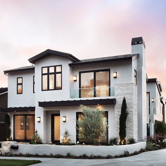
I mean come on. The dark windows add so much needed contrast to the all-white walls and by breaking up the walls and giving them depth. On the exterior, they add just a touch of sophistication and in an interior space, they really draw your attention to the view.
For our interior doors, we chose the Rockport 5-panel style to keep with the modern look of the house. The architectural detail in our house has a lot of soffits and square archways (is that a thing?), yet the standard doors had curved panels which totally didn’t match. The door upgrade was a MAJOR steal at only $400 for the entire house! It would’ve been a couple of THOUSAND dollars to do this on our own so that upgrade was a no-brainer. We spent another $350 to have them painted Repose Gray and probably could’ve tackled that one ourselves, but after you see allllll of the other projects we have planned you’ll understand why we just needed some things to be done when we moved in. We didn’t get to choose any of our paint colors until our in-person meeting, so naturally, I almost had a mental breakdown beforehand overthinking everything. For days I contemplated Repose Gray and Mindful Gray for the doors and tried to determine the perfect shade of white for the walls and trim. I’m an uber-visual person, so I needed to I looked at a BUNCH of pictures of both colors, on doors, walls, trim, cabinets, everything.
In the end, I decided I liked Repose Gray more because of the cool undertones, as opposed to the sometimes muddy look of Mindful Gray. For the walls, I wanted a true white color without any undertones, but I also didn’t want it to be too stark. I had finally settled on SW Alabaster when BAM!—Mindful Gray and Alabaster weren’t even in Ashton Wood’s list of standard paint color options. I did all that worrying for nothing and ended up with Repose Gray on the doors and Extra White on the walls and trim. Ya win some, ya lose some. I still could’ve chosen a different shade of white for the walls, but changing the trim color to match would’ve been another upgrade so I opted to keep them both the standard Extra White.


As you can see in the swatches, Alabaster is a little warmer and cozier than Extra White, which has just the slightest bit of a blueish undertone. On a large scale, both undertones are barely noticeable, making Extra White what I would consider to be a true white tone. It won’t read as yellow, blue, or grey in certain lighting, it’ll just be plain white.
The hardware decisions for the house required the most research and cost comparison out of all the choices we had to make, mainly because I knew that hardware is super easy to change out on your own. The door hardware we wanted would’ve been around $1000 for the whole-home upgrade, but by shopping around I was able to find the same hardware for less than $600 total. The story was the same in the kitchen and both bathrooms. Our kitchen came with a pretty typical, chrome faucet and separate handheld sprayer. The kitchen faucet was a little under $1200 as an upgrade or less than $500 to change ourselves. You tell me which was the better option.

Our modern black bathroom hardware was $1800 for the master bath and $1350 for the secondary bath, but only $1200 TOTAL for both bathrooms if we changed out all the hardware ourselves! Those prices include all of the matching accessories as well—the shower hardware, towel rack, toilet paper holder, everything. This is why I loooved being able to do all of my research before our design studio appointment so that I didn’t feel pressured into buying a ton of overpriced upgrades without knowing their true cost. Sure it’ll take us some time to go through and change everything out, but that’s nothing compared to the money we’re saving now (and later) by not wrapping those extra design costs into our mortgage. There was one small, unfortunate caveat to this though…By not upgrading our bathroom hardware, we would be getting the standard 4” spread faucets. Whomp, whomp, whomp. We really wanted the 8” spread in the master because we both love the look of the separate handles and faucet. They just add an extra special touch and make the bathroom feel more custom in my opinion. However, I didn’t think that that small touch is worth almost $2k so the 4” spread will do for now. At some point, we’ll probably change out the plain white, cultured marble countertop for something with a little more design to it and then we’ll be able to change the faucet to the 8” spread we really want! Also, since we went with the standard chrome faucets, the shower enclosure had to be chrome as well or upgraded to the $2000 frameless enclosure. Uh, no ma'am. The frameless enclosure was super pretty, but again, not worth the price for such a small shower. So we’ll be DIYing that one too and painting the frame black ourselves. We didn’t get any cabinet hardware installed in the bathrooms or kitchen (I didn’t even ask to see any) because I knew it would be cheaper to do on our own, plus we could get a more custom look that way. We haven’t decided on exactly what it’ll be, but you can guess it’ll be, that’s right…matte black!
We didn’t upgrade any of our lighting fixtures or add ceiling fans because those are almost always cheaper to do yourself, plus the builder’s options are very limited. If you want a more custom look, stick with the standard options that the builder offers and switch out the fixtures on your own later. That way you can handpick the fixture in each room to match your design plan and save money. To wrap up our initial selections, we added in a few other “hidden” upgrades (things you don’t really notice) like raising the shower heads in both bathrooms and the vanity in the secondary bathroom. We also took off a few things that we didn’t really need like shower niches and raised height toilets so that we be at a more comfortable subtotal before it came to choosing the big stuff at The Studio!
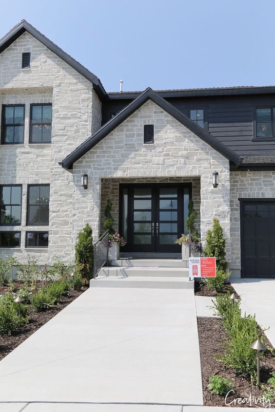
The Studio is the name of Ashton Woods’ design center and it was nothing short of a dream—exactly how I imagined it would be. There were samples on samples on samples of gorgeous tiles, wood flooring, cabinet styles, kitchen faucets—they had so much to choose from! Each of the sample walls you see in my pictures opened up like a hidden door to reveal even more options behind them. The walls were lined with tons of options, but I was a woman on a mission and determined not to let the excitement of the experience get the best of me. After all, beauty has a price.
Before going to our studio appointment, Ira and I pinned hundreds of ideas to our shared idea board for our house so that we had a clear vision going in. We already had a pretty good general idea of knew what we wanted the rooms to look like, which made it a lot easier to narrow down our options at The Studio. We’re both drawn to bold, neutral spaces with lots of contrast—basically a mix of modern farmhouse and contemporary styles.


Originally we wanted a two-toned kitchen with wood upper and black lower cabinets, but our builder didn’t allow that type of combination. Any secondary color would have to be put only on the island which wasn’t worth it to me since the color would only be visible from the front. So instead we went with espresso cabinets that are a super dark, black-brown color in a shaker style. Of course, that style was a Level 5 upgrade since shaker cabinets are so popular right now, but it was totally worth it. We have an open floor plan, with the kitchen spilling right into the breakfast nook and living room. We’ll spend the majority of our time hanging out and entertaining in that big main area of the house, which means everyone will see the kitchen all the time, so it needed to be functional, pretty, and timeless.
Truth be told, resale value isn’t anywhere near the top of my list for factors I consider when designing, so when I say timeless I mean that it’s something I could live with for a while. I want the space to work for our family since we’re the ones that will be living there for the next 5, 10, who knows how many years. I don’t consider some imaginary family that may or may not buy the house one day when it comes to most of my design choices because things change constantly. Trends change, styles change, opinions change. And anything that you can install, you can take right back out. I’m a firm believer in making your space for you and your family now and worrying about pleasing other people later. However, if we’re talking resale value, a lot of your home’s resale value comes from the kitchen and bathrooms, so you do want those to be as nice as you can afford. And if there’s one area of your home I recommend not skimping on, it’s the kitchen.


The image on the left is the model home of our floor plan with the same cabinets we chose. I LOVE the look of a tuxedo kitchen, so we kept all of the other elements white to contrast the dark cabinets. We also upgraded the layout of the kitchen, so we’ll have a microwave/wall oven combo on the right side and an actual vent hood above the cooktop like the image on the right. This is another one of those features that instantly elevates the look of any home, making it look more custom. We opted not to get the cabinets above the fridge or the side panel, although I do recommend getting both! Your kitchen will look so much more finished with the cabinets spanning the entire length of the space instead of stopping when it gets to the fridge. We haven’t quite decided on which fridge we’re going to buy yet though and didn’t want to risk the space being too small since there are cabinets on one side and the pantry on the other. We’re currently toying with the idea of doing something a little more decorative and fun with that space since I can even reach up there anyway! I’m kinda digging the idea of using the space to store our wine bottles, but if we change our minds, Home Depot carries our exact cabinets so we can always go back and add them later.
For the bathrooms, we chose a maple shaker style cabinet in the color Rye (right image). They look SO pretty with the dark hardware and white countertops and will add some much-needed warmth to those spaces.

For the kitchen countertops, we went with Silestone quartz in the color Helix. I really wanted a marble-look, without having to get actual marble and this fit the bill perfectly. There’s just enough movement and color variation that it looks similar to marble, but since it’s a manmade stone it’ll be much more durable than marble. The slight veining, flecks of sparkle, and shiny white finish will look AMAZING next to the dark features. With that same stone, we’ll also be getting *drumroll please*…a waterfall island! I can’t even tell y’all how long I’ve wanted a waterfall island and I almost had to cut it from my list! I knew that getting this installed later would’ve been super expensive (not to mention a PITA) so we asked for Ashton Woods to make a custom one for us. The island in our house is pretty large and the focal point of the kitchen, so it’s only right that it stands out.

This is a pretty close example of one that AW had in The Studio. Doesn’t it just make your heart flutter? Ours will have drywall along the back wall rather than cabinet faces and I’m thinking I’ll probably add some kind of accent of my own to really make it stand out in the space. After spending another boatload of money on this—$4,250 to be exact. I get heart palpitations just thinking about it. Not flutters. Sharp shooting pains.— there were quite a few things we had to pass on that we originally planned to get:
Soft close drawer and door hinges—We can do this ourselves for about half the upgrade price.
Glass inserts in the upper cabinets—I wasn’t 100% sold on this anyway since I’m not sure exactly where everything will be stored, but I can always change them out later without having to replace the entire cabinet.
Upgrading the quartz thickness to 3cm—This would’ve added another $860 sooo, no.
Drawers under the cooktop instead of the standard two doors—The drawers definitely would’ve been more functional, but they were $375. I can add my own pull-out slider inserts to the cabinet for much cheaper than that.
Built-in, pullout trashcan—I believe this was around $250, but you can DIY for so much cheaper than that. It also would’ve taken away my island cabinet with 4 stacked drawers which I really wanted to keep, so I’ll have to find another spot for the trashcan.
So, now that you know we blew most of our design budget on the windows and island—these are happy tears, I swear—you’ll undoubtedly understand our final decision: we didn’t upgrade any of the floors.
That’s right. We went with the standard tile/carpet combo. We reallllly wanted a super light engineered wood or vinyl plank flooring, but our builder only carried that style in real wood. I know all too well how sharp Ginger’s nails can get, so I definitely didn’t want anything that would just end up getting scratched, scuffed, or dented. When we were making our initial selections, we settled on the next best thing, which was a medium tone vinyl plank (left). However, after seeing the price our builder quoted us for just the main area of the house (no bedrooms or offices), we realized we’d be paying almost $9 per sq. ft. (including labor) for flooring that we weren’t even in love with. Cutting out the flooring upgrade saved us almost $6k on our upgrades.


The flooring look that we actually want ranges from $5-$8 per sq. ft. in materials, but we can do the installation ourselves. Depending on the flooring we choose, we could do the whole house for just a little more than what our builder was charging for the main area. Not only is this a great savings, but we’ll be able to select a flooring we really want instead of settling for the options our builder had. If we’re gonna settle, we better be settling for free, ya feel? This will be a BIG project in time and money so it definitely won’t be happening right away. I’ll have to learn to live with the tile (ew) and carpet (double ew) until we can replace it later. If you follow me on Pinterest though, you may have seen I already have big plans for that tile flooring to hold me over until we can rip it all out!
I know I didn’t touch on every single thing we picked, so keep an eye out for more posts about our design selections and plans for the new house! I’ll break it down room by room since we have SO many project ideas already, these posts get pretty lengthy trying to cover everything. Let me know what you think about our selections so far in the comments and I’m dying to know—would you have gone for the flooring upgrade or the waterfall island? How about those windows? The best part is, there is no wrong choice. Happy homebuilding!